
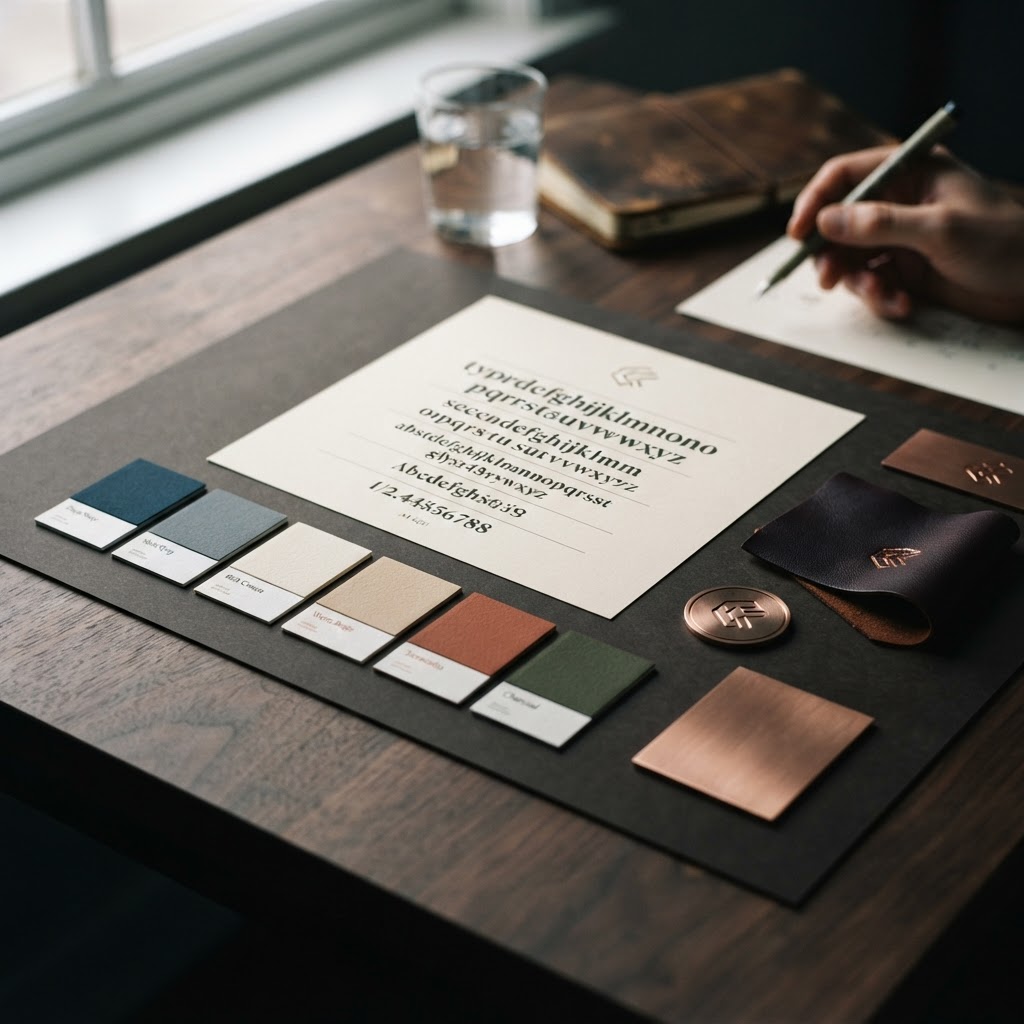
How F.I.D. Studio approaches brand design across its SaaS portfolio — consistent identity, purposeful colour, and why trust starts with visual clarity.
A brand isn't a logo. It's the feeling people get when they interact with your product — from the colours on your landing page to the tone of your error messages to the weight of the font in your buttons. At F.I.D. Studio, we design brands that build trust through clarity, not flash.
One Brand, Multiple Products
F.I.D. Studio operates multiple SaaS products, each with its own audience and use case. But they all share a common design philosophy:
Professional, not corporate. Our interfaces feel polished and considered, not sterile or impersonal. We use warm tones alongside professional neutrals to create a feeling that's both trustworthy and approachable.
Dark where it matters. Several of our products use dark themes — not for trendiness, but because the use cases demand it. FrgeTrade's dark luxury aesthetic reduces eye strain for traders during long sessions. ChurchStage's dark interface is designed for dim worship environments.
One accent, consistently applied. Each product has a single accent colour that signals brand identity and guides attention. Gold for FrgeTrade. A warm, inviting tone for ChurchNote. A clear, operational colour for ChurchRide. Within each product, the accent is used consistently for primary actions and key highlights — never scattered across every element.
The Role of Typography
Typography is the most underappreciated element of brand design. The font you choose communicates personality before a single word is read.
Across F.I.D. Studio products, we use clean, humanist sans-serifs for body text — prioritising readability on both desktop and mobile. For headings, we use slightly more characterful weights that create visual hierarchy without being decorative. The result is text that's easy to scan, pleasant to read, and consistent across every page.
Colour and Trust
Colour psychology in design isn't about manipulation — it's about creating the right emotional context. Dark, deep backgrounds with a single warm accent (our approach for FrgeTrade) create a sense of focus and premium quality. Lighter, warmer palettes (our approach for ChurchNote) create a sense of openness and personal comfort.
The key is consistency and restraint. When a product uses one accent colour consistently, users learn to associate that colour with actions and states. "Gold means the primary action." "Red means danger or deletion." This learned visual language makes the product feel intuitive without needing extensive tutorials.
What We Avoid
- Stock photos that don't represent real users. If your product photo shows a smiling person at a laptop, but your actual users are church administrators or shift managers, you're creating a disconnect.
- Inconsistent spacing. If your buttons have different padding on different pages, it signals "we didn't have a design system."
- Too many fonts. More than two font families in a single product is almost always too many.
- Decorative elements that don't serve function. Every visual element should either guide attention, provide context, or reinforce brand identity. If it's just "pretty," it's noise.
The Bottom Line
Brand design for SaaS is about creating trust through consistency and clarity. A user who opens your product for the first time should feel "this is professional, this is clear, I know what to do" — not "this looks cool but I'm confused."
At F.I.D. Studio, we design every product with that goal. Trust starts with visual clarity. Clarity comes from restraint. And restraint is the hardest design skill to master.